top of page
ADAM IVES - GAMES DESIGN

Phase Three
Affordance Prototype
General Idea:
The main flaw of the game idea so far is an issue concerning affordances. Currently, Idea 1 plays around with the concept of taking the player on a journey which will give them time to enjoy the natural scenery, experience escapism and relax. The game does not try to be stressful in any way, there is no challenge, and many of the interactions the player has with the world are optional. However, the flaw comes with the ability to interact, we want the players to do what they want along their journey from A to B, they can stop and rest, experience everything the game has to offer or run all the way to the end. The problem with this, however, is that we want it to be a decision rather than a missed opportunity. If the player doesn't want to interact, we want them to make this choice willingly, as opposed to accidentally missing everything the game presents them. The issue, therefore, lays with affordances, we need to make interactions obvious but not too in your face. The Interactions of the game need to be shown, but must also simultaneously blend in with the simplistic and natural background.
I have already researched what affordances are, why they are important and how they are used in video games. In case you haven't seen this research, please click the link here. I have speculated that to afford interaction in this game, and interactable object should stand out slightly. I propose that this may happen through any of the following ways:
-
The item could be highlighted
-
The item could be a different shade to non-interactable items.
-
The item could have a particle effect surrounding it
-
The item could have a butterfly circling it.
Prototype:
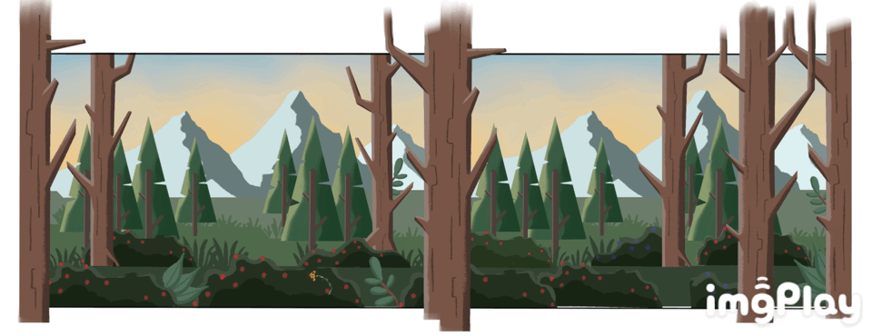
To prototype this idea, I have chosen to test affordances within a game world. I have created a number of assets to the style of Vector Art, as it was simple and stylistic, and I have arranged them to form a scene. In this scene, four bushes will have the aforementioned ways of making them stand out assigned to them. I will then tell the player the controls (left arrow to go left, right arrow to go right and A to interact with objects in the scene). The first item they go to should give an idea of what stands out more.
This prototype is obviously somewhat limited, as the rest of the scene would have animations like birds flying in the sky and trees rustling, which arguably could take the players attention away from how the items afford an interaction, however, as a prototype it may help us understand how to afford to the players that they can interact with the world around them, ensuring that they do not accidentally miss any of the games fine details.
Assets:
Below you can find the assets which I created for this prototype. It was essential to making a fairly detailed scene, otherwise testing an affordance in an empty scene could skew the results. A single item in a scene is more likely to
Affordances in Action:
Using the assets, I created a scene which contains 5 items which afford player interaction. You can see these in the gif below. Some are more obvious and immediately bring the players attention to an object, others were designed to be more subtle and immersive. 4 of the affordances are animated to draw the players attention, one is still to test if it is as obvious.
In case you can not spot all of the affordances, I have circled them all below, and numbered them to help address how they afford interaction.
1. [SPARKLE] This design is a temporary representation of particles circling interactable objects. As it is a prototype, it has not got the same sort of movements I imagine it would have in a final product, however it serves the same purpose. Personally I think this design affords interactability well, as it quickly grabs the attention of the player.
2. [BUTTERFLY] The butterfly design would be used in practice to express to the player any object which can be interacted with. However, straight away I can spot issues with having an affordance designed in this way. In a more complicated scene, the player may just assume its part of the scene, and something they are meant to witness and enjoy, not something they can interact with. With the design being something natural, some may see it as world-building rather than a hint.
3. [COLOUR CHANGE] This is the least obvious design I created. Instead of making the design intrusive I thought if I changed the colour of the object it may stand out more. The only issue, however, is that it blends in too much. I have already tested this scene briefly, and the viewer never even noticed that this design was affording interaction. In a busier scene, it is not difficult to hypothesise that this design may be overcast by animations and visuals.
4. [FADE] This design works fairly well in my opinion. It immediately pulls the viewer's attention to it and doesn't add too much to the scene which ultimately maintains an immersive environment.
5. [OUTLINE] This design is a less obvious version of 4. It allows the object to maintain its original colours whilst simultaneously drawing attention to it.
Testing the Prototype:
Once the prototype was made in unity to track which affordances people click and notice, it was exported as an Ipad project and taken around classrooms to see which ones grab users attention.
No. 1 and No. 4 were the most successful at grabbing the users attention. Every person who tested noticed these affordances, and almost every time No. 1 was picked first.
No. 2 was picked up on most of the time, however, some users did not click on it, stating that they thought it was part of the environment and not an affordance for the bush it was circling.
No. 5 was occasionally missed but was noticed most of the time. This may be because it was somewhat hidden behind the tree in front of it. But since not every interactable object will be in the foreground, so if it is missed when it is in the background, then it isn't a great affordance.
No. 3 was the worst affordance, as almost every tester did not notice the slight colour change. This is by far a subtle affordance, but it is too subtle to have any use in our game.
Below you can find some of the examples of test results, it shows how many objects were found and in what order:
Research:
For research surrounding my affordance prototype, please lcik the link below:
_JPG.jpg)

Test No. 5

Test No. 7

Test No. 11
Test No. 5
1/3

bottom of page